Creating an intuitive and user-friendly interface is crucial for success in the app development world. With SwiftUI menus, you can now easily achieve this goal by displaying secondary actions in a compact and organized manner. Menus are interactive components designed to save space and declutter the app’s interface. SwiftUI menus are special buttons, you can learn see how buttons work in this post.
This blog post will explore SwiftUI menus, their benefits, and how they can be implemented effectively.
Some common use cases for menus include
- Disambiguation: Clarifying user choices when performing an action, such as selecting a specific item to add to the Photos app.

- Navigation: Navigate through an app’s history or content, like browsing previously visited sites in Safari by tapping and holding the “back” button.

- Selection: Making a selection among multiple options, as seen in the Podcasts app where users can tap the “Sort” button to choose a sorting method.

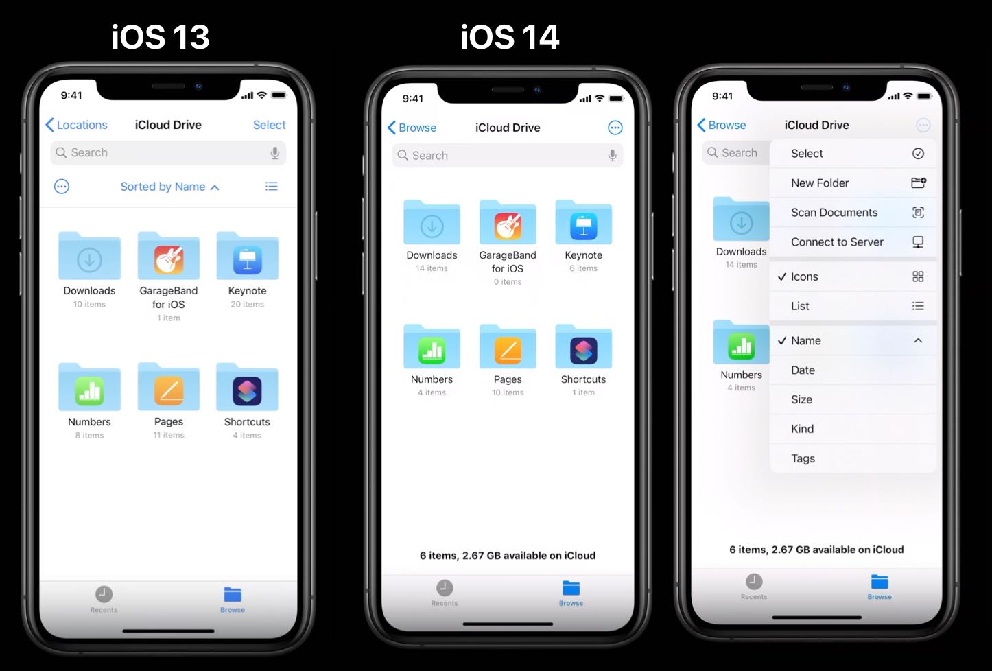
- Displaying secondary options: Present additional actions that are not frequently used but still easily accessible, such as the “more” button in the Files app.

By incorporating menus into your SwiftUI app, you can ensure a more organized and efficient user interface that effectively displays secondary actions without overwhelming users. Stay tuned as we dive deeper into the world of SwiftUI menus and explore how to implement all these different use cases.
If you want to learn more about best practices for menus, watch the Design with iOS pickers, menus and actions presentation from WWDC 2020. The examples above are from this talk.
SwiftUI Popup Menu Button
SwiftUI makes it simple to create menu buttons with just a few lines of code. In this section, we’ll demonstrate how to implement a SwiftUI menu button. If you want to reproduce the Photos app example from above. This menu button will show dropdown options for creating albums, shared albums or folders:
struct ContentView: View {
    var body: some View {
        Menu {
            Button {
            } label: {
                Label("New Album", systemImage: "rectangle.stack.badge.plus")
            }
            Button {
            } label: {
                Label("New Folder", systemImage: "folder.badge.plus")
            }
            Button {
            } label: {
                Label("New Shared Album", systemImage: "rectangle.stack.badge.person.crop")
            }
        } label: {
            Label("Add New", systemImage: "plus")
        }
    }
}
You can also create a Menu with a secondary action. This was used in the Safari app for the back button:
Menu("menus with long press") {
    Button("first") { }
    Button("second") { }
    Button("last") { }
} primaryAction: {
   // execute primary action
}
If the user taps on the button, the primary action is executed. However when the user long press, the menu list is shown.
Organising the list of buttons inside menus
The appearance of the buttons inside the menu button list, is defined by the system. Apple recommends to show icons for all buttons.
One option is to use a button role of destructive. This will make the button have a red foreground color. This should be used for a delete button:
Menu {
    Button("first") {  }
    Button("second") {  }
    Button("Delete", role: .destructive) {  }
} label: {
    Label("Menu", systemImage: "ellipsis.circle")
}
Long lists of buttons can become unreadable. You can add sections and dividers inside the Menu list to make them more organized:
Menu {
    Section("Primary Actions") {
        Button("First") {  }
        Button("Second") {  }
    }

    Button {
        // Add this item to a list of favorites.
    } label: {
        Label("Add to Favorites", systemImage: "heart")
    }

    Divider()

    Button(role: .destructive) {
    } label: {
        Label("Delete", systemImage: "trash")
    }
} label: {
    Label("Menu", systemImage: "ellipsis.circle")
}
In order to replicate the Files app example from above, you can place the Menu inside a ToolbarItem:
struct ContentViewView: View {
    var body: some View {
        NavigationView {
            Text("Something important to show")
                .padding()
                .navigationTitle("Menu")
                .toolbar {
                    ToolbarItem {
                        Menu {
                           ...
                        }
                    }
                }
        }
    }
}
You can also use submenus to organize better. The submenu will appear above the main menu:
Menu {
    Button("first") {  }
    Button("second") {  }
    Menu {
        Button("third") {  }
        Button("forth") {  }
    } label: {
        Label("More", systemImage: "folder.circle")
    }

    Button("Delete", role: .destructive) {
    }

} label: {
    Label("Menu", systemImage: "ellipsis.circle")
}How to keep the menu list order?
A new feature for iOs 16 and macOS 13 is the menuOrder modifier.
Menu {
    Button("first") {  }
    Button("second") {  }
    ...
} label: {
    Label("Menu", systemImage: "ellipsis.circle")
}
.menuOrder(.fixed)
You have the following options
- priority order keeps the first items closer to the user’s point of interaction
- fixed order always orders items from top to bottom.

How to Customize the SwiftUI Menu Button Appearance
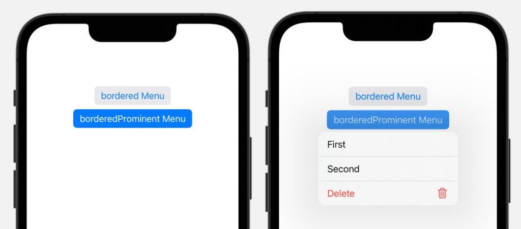
Because Menus are buttons with an extra dropdown view, you can style them like regular buttons. See how you can fully customize buttons in Mastering SwiftUI Buttons: A Comprehensive Guide to Creating and Customizing Buttons. For example, you can use the bordered button style like so:
Menu("bordered Menu") {
    Button("First") { }
    Button("Second") { }
}
.buttonStyle(.bordered)
MacOS specific Menu Styling
Menu looks quite different on macOS. Per default menus have a border and a menu indicator. To change the border style use menuStyle:
Menu("Menu borderless button style") {
    ...
}
.menuStyle(.borderlessButton)
In order to hide the menu indicator, you can use the menuIndicator modifier:
Menu("Menu indicator hidden") {
    ...
}
.menuIndicator(.hidden)
How to create a selection Menu with Picker
If you want to allow the user to select from a list of predefined options, like sorting in the Podcast app, it is best to use a Picker. Picker has a style that will make it look like a menu. Read about SwiftUI Picker Made Easy: Tutorial With Example.
Let’s recreate the example and start with an enum data definition for Sorting:
enum AlbumSorting: String, CaseIterable, Identifiable {
    case title
    case recentlyAdded
    case artist
    var id: Self { return self }

    var title: String {
        switch self {
            case .title:
                return "Title"
            case .recentlyAdded:
                return "Recently Added"
            case .artist:
               return "Artist"
        }
    }
}
Showing a picker with the menu style can be done with the following example code:
struct ExampleView: View {
    @State private var selectedSorting = AlbumSorting.artist
    var body: some View {
        Picker("Sort", selection: $selectedSorting) {
            ForEach(AlbumSorting.allCases) {
                Text($0.title)
                  .tag($0)
            }
        }
        .pickerStyle(.menu)
    }
}
It shows the selected item. For the Album app example, we want to show something different. The can be done by embedding the picker inside a menu like so:
Menu {
    Picker("Sort", selection: $selectedSorting) {
        ForEach(AlbumSorting.allCases) {
            Text($0.title)
        }
    }
} label: {
    Text("Sort")
}
SwiftUI contextMenu to create dropdown menu to any view
How to create context menu in Swift?
To use a context menu in SwiftUI, attach the .contextMenu modifier to the view you want the context menu to be associated with. Inside the context menu modifier, add Button views for each option you want to include in the context menu. Here’s an sample code with an image:
Image("candies")
    .resizable()
    .scaledToFit()
    .frame(width: 200)
    .contextMenu {
        Button {
            print("action for context menu item 1")
        } label: {
            Label("First", systemImage: "icon_name")
        }
        // Additional context menu items
    }
It is very common to right-click on a list or table item on macOS. The following is an example with a table. When you right-click on a row, a blue border is created around the selected row together with the menu.
Table(of: InventoryItem.self) {
    TableColumn("Name", value: \.name)
    TableColumn("Partnumber", value: \.partNumber)
    TableColumn("Quantity") { item in
        Text(String(item.quantity))
    }
} rows: {
    ForEach(items) { item in
        TableRow(item)
            .contextMenu {
                Button("Add To Shopping List") {  }
                Button("Quick Buy") {  }
                Button("Request Larger Number") { }
            }
    }
}
Conclusion
SwiftUI menus and context menus provide an efficient and compact way to organize secondary actions and options in your application. By understanding their use cases and implementation, you can create a more user-friendly and organized interface for your app. As we’ve explored in this blog post, implementing menus and context menus in SwiftUI is straightforward and versatile, allowing you to cater to various user interactions and adapt to different device types. Utilize these powerful components in your SwiftUI app to enhance the user experience and streamline your app’s functionality.
FAQ
What is the menu in button SwiftUI?
The menu in button SwiftUI refers to a menu that is triggered by tapping on a button in a SwiftUI application. This menu is used to display secondary actions or choices related to the button, providing a compact and efficient way to organize functionality in your app.
How do I add a menu in SwiftUI?
To add a menu in SwiftUI, use the Menu view and define the menu items as Button views inside the Menu. You also need to specify the menu button’s appearance using a Label view. Here’s an example:
Menu {
    Button {
        // action for menu item 1
    } label: {
        Label("Menu Item 1", systemImage: "icon_name")
    }
    // Additional menu items
} label: {
    Label("Menu Button", systemImage: "icon_name")
}
What is the difference between context menu and menu in SwiftUI?
In SwiftUI, a Menu is typically associated with a button and is activated when the button is tapped. It is used to display secondary actions or options related to the button. On the other hand, a context menu is associated with a specific view and is activated by long-pressing or right-clicking on the view. Context menus provide contextual options or actions related to the view they are attached to. Both menus and context menus can be created using similar components, such as Button and Label views, but their use cases and activation methods differ.
Further Reading
- Learn how to customize buttons which work the same as for menus: Mastering SwiftUI Buttons: How to Create and Customise Button
- Compare to picker view with SwiftUI Picker Made Easy: Tutorial With Example
